
As another installment of the “demoing the plate reader” series, we’re also trying to see how well it quantitates DNA. Probably good that I’m actively involved in this process, as it’s making me learn some details about some of the existing and potential assays regularly used by the lab. Well, today, we’re going to look a bit at DNA binding dyes for quantitating DNA.
We have a qubit in the lab, which is like a super-simplified plate reader, in that it only reads a single sample at a time, it only does two fluorescent colors, and the interface is made very streamlined / foolproof, but in that way loses a bunch of customizability. But anyway, we started there, running a serial dilution of a DNA of known high concentration and running it on the qubit (200uL recommended volume). We then took that same sample and ran it on the plate reader. This is what the data looked like:

So pretty decent linearity of fluorescence between 1ug to 1ng. Both the qubit and plate reader gave very comparable results. Qubit readings missing on the upper range of things for the qubit since it said it was over the threshold upper limit of the assay (and thus would not return a value). This is reasonable, as you can see by the plate reader values that it is above the linear response of the assay.

So what if you instead run the same sample as 2uL on a microvolume plate instead of 200uL in a standard 96-well plate? Well, you get the above result in purple. The data is a bit more variable, which probably makes sense with the 100-fold difference in volume used. Also seems the sensitivity of the assay decreased some, in that the results became unreliable around 10ng instead of the 1ng for the full volume in plate format, although again, I think that makes sense with there being less sample to take up and give out light.
7/3/23 update:
Just tried AccuGreen from Biotium. Worked like a charm. They suggest mixing in ~200uL of DNA dye reagent (in this case, to 1uL of DNA already pipetted in), but I tried 100uL and 50uL as well, and if anything, 100uL arguably even looked the best.
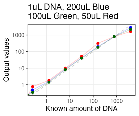
Also, I just used the same plate as Olivia had run the samples on Friday. So in running these new samples, I ended up re-measuring those same samples 3 days later. And, well, it looked quite similar. So the samples for reading are quite stable, even after sitting on the bench for 3 days.

Oh, and lastly, this is what it looked like doing absorbance on 2uL samples on the Take3 plate. Looks perfectly fine, although as expected, sensitivity isn’t nearly as much as Accugreen. That said, you do get more linearity at really high concentrations (4000 ng/uL), so that’s kind of nice.


