
Once in a while, someone will ask me how many cells they will need to be recombine to get full coverage of their variant library. And I always tell them that they should just simulate it for their specific situation. I essentially refuse to give a “[some number] -fold coverage of the total number of variants in the library” answer, since it really oversimplifies what is going on at this step.
More recently, I was asked how I would actually do this; hence this post. This prompted me to dig up a script I had previously made for the 2020 Mutational Scanning Symposium talk.
But it really all starts in the wet-lab. You should Illumina sequence your plasmid library. Now, practically speaking, that may be easier for some than others. I now realize just how convenient things like spike-ins and multi-user runs were back in Genome Sciences, since this would be a perfect utilization of a spike-in. In a place without as much sequencing bandwidth, I suppose this instead requires a small Miseq kit, which will probably be 0.5k or something. I suppose if the library was small enough, then perhaps one or a few Amplicon-EZ -type submissions would do it. Regardless, both the PTEN and NUDT15 libraries had this (well, PTEN did for sure; I think NUDT15 did b/c I have data that looks like it should be it). This is what the distributions of those libraries looked like. Note: I believe I normalized the values from both libraries to the frequency one would have gotten for a perfectly uniform library (so 1 / the total number of variants):

We definitely struggled a bit when we were making the PTEN library (partially b/c it was my first time doing it), resulting in some molecular gymnastics (like switching antibiotic resistance markers). While I don’t know exactly what went into making the NUDT15 library, I do know it was ordered from Twist and it looked great aside from a hefty share of WT sequences (approx 25%).
Anyway, I’m bringing these up because we can use these distributions as the starting population for the simulation, where we sample (with replacement) as many times as we want the number of recombined cells to be, and do this for a bunch of cell numbers we may consider (and then some, to get a good sense of the full range of outcomes).

So yea, the NUDT15 library had a tighter distribution, and it got covered way faster than the PTEN one, which was rather broad in distribution. Looks like the millions of recombined cells is nicely within the plateau, which is good, since this is the absolute minimum here: you definitely want your variant to get into more than one cell, and the plot above is only one. The curve moves to the right if you ask for a higher threshold, like 10 cells.
But maybe you don’t have your library sequenced? Well, I suppose the worst you could do is just assume your library is complete and uniform, and go from there knowing full well that what you see will be the unattainable best case scenario. I suppose another option is to try to use approximations of the NUDT15 or PTEN libraries as guides for potentially realistic distributions.
So I ran some function that told me what a hypothetical log-normal distribution fitted to the real data was (I’m glossing over this part for today), and apparently the NUDT15 library log-normal mean was -8.92 and log-normal sd was 0.71. On the other hand, the PTEN library log-normal distribution had a mean of -9.58 and sd of 0.99. So using those numbers, one could create NUDT15 or PTEN library-esque distributions of variants of whatever sizes you want (presumably the size of your library). But in this case, I created fake PTEN and NUDT15 datasets, so I can see how good the approximation is compared to the real data.

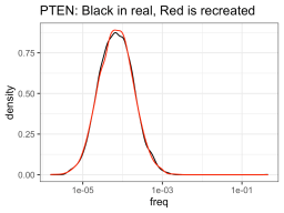
So it definitely had much more trouble trying to approximate the NUDT15 library, but eh, it will have to do. The PTEN library is spot on though. Anyway, using those fake approximations of the distributions allows us to sample from that distribution, n number of times, with n being one from a bunch of cell numbers that you could consider recombining. So like, one-hundred thousand, quarter million, etc. Then you can see how many members of the library was successfully recombined (in silico).

Well, so the fake NUDT15 library actually performed much worse out of the gate (as compared to the real data), but evened out over increased numbers. PTEN had the opposite happen, where the fake data did better than the real data, though this evened out over increased numbers too (like 1e5). But to be honest, I think the more realistic numbers are all pretty similar (ie. If you’re thinking of recombining a library of ~5,000 members into 10,000 cells, then you are nuts).
So based on this graph, what would I say is the minimum number of recombined cells allowed? Probably something like 300k. Though really, I’d definitely plan to get a million recombinants, and just know that if something goes wrong somewhere that it won’t put the number below a crucial region of sampling. Well, libraries of approximately 5,000 variants, and a million recombinants. I guess I’m recommending something like 100 to 200 -fold coverage. Damn, way to undercut this whole post. Or did I?
BTW, I’ve posted the code and data to recreate all of this at https://github.com/MatreyekLab/Simulating_library_sampling
Also, I dug up old code and tried to modify / update it for this post, but something could have gotten lost along the way, so there may be sone errors. If anyone points out some major ones, I’ll make the corresponding fix. If they’re minor, I’ll likely just leave it alone.


